
Ready to transform your home’s interior? This article explores 10 house painting styles that can dramatically elevate your space. From the calming serenity of minimalist painting to the bold statement of accent walls, we’ll guide you through diverse techniques and color palettes to achieve your dream interior. Discover how strategic interior painting can enhance architectural details, maximize natural light, and create a truly personalized living environment. Let’s dive into the world of house paint colors and painting techniques to find the perfect style for you!
Ombre Walls
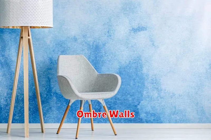
Ombre walls are a fantastic way to add depth and visual interest to any room. This trending design technique involves a gradual transition of color, creating a soft, sophisticated look that’s both modern and timeless. Forget stark, single-color walls; ombre offers a dynamic alternative that can completely transform your space.
The beauty of an ombre wall lies in its versatility. Whether you prefer a subtle shift in tone or a bold, dramatic change, the possibilities are endless. Light and airy pastels can create a calming oasis, while rich, deep hues can add a sense of drama and luxury. The color palette you choose will depend entirely on your personal style and the overall aesthetic of your room.
Creating an ombre wall is easier than you might think. While you can certainly hire a professional, it’s a DIY-friendly project that requires only a few basic supplies: paint in your chosen shades, brushes or rollers, and painter’s tape (optional). The key is to carefully blend the colors together to achieve a seamless gradient. Several online tutorials offer step-by-step instructions and helpful tips for achieving professional results.
Consider the placement of your ombre wall. A feature wall behind a bed or sofa can make a striking statement, while a subtle ombre effect on an accent wall can add a touch of elegance without being overwhelming. Experiment with different color combinations and placement to find the perfect fit for your home.
Beyond the bedroom and living room, ombre walls can be used in bathrooms, hallways, and even kitchens to create a unique and personalized atmosphere. The technique is remarkably adaptable and can complement various interior design styles, from minimalist to bohemian.
In conclusion, embracing the ombre wall trend is a simple yet effective way to elevate your interior design game. Its adaptability and stunning visual impact make it a worthwhile investment of time and effort. So, why not add a touch of sophisticated color blending to your home today?
Stripped Accent Wall
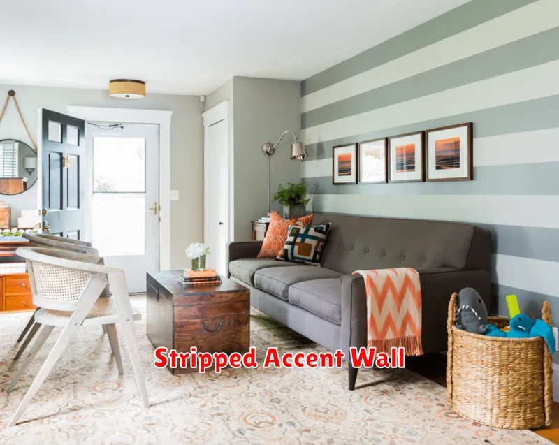
Want to add a touch of modern farmhouse charm to your space without a major renovation? A stripped accent wall is the perfect solution! This simple yet impactful design trend is taking the interior design world by storm, and for good reason. It’s surprisingly easy to achieve, and the results are stunning.
The beauty of a stripped accent wall lies in its versatility. The “stripped” effect can be achieved in numerous ways, catering to various styles and skill levels. You can opt for a simple, clean-lined approach using painter’s tape and two contrasting colors, or go for a more rustic, textured look by using a variety of paint techniques and colors. The possibilities are endless!
One popular method involves using a base coat of a neutral color like creamy white or soft gray. Then, using painter’s tape, create geometric shapes or stripes of varying widths. Fill in these shapes with a contrasting color, perhaps a bold navy, deep teal, or even a warm terracotta. Once the paint is dry, carefully remove the tape to reveal crisp, clean lines. Consider adding a clear sealant for extra protection and durability.
For a more rustic and textured effect, consider using a sponge or rag to apply the contrasting color, creating a slightly uneven, more organic finish. This technique works particularly well in spaces that lend themselves to a more relaxed and informal style. Experiment with different shades of the same color family for a subtle, layered look, or opt for a dramatic contrast for a bolder statement.
Regardless of the technique you choose, remember to prepare the wall properly before you begin. This includes cleaning the surface and filling any holes or cracks. Proper preparation ensures that your paint will adhere correctly and that your finished accent wall will look its best. With a little creativity and effort, you can transform a simple wall into a stunning focal point that adds character and personality to your home.
So, are you ready to embrace this trending design? A stripped accent wall is a relatively low-cost, high-impact project that is perfect for DIY enthusiasts of all levels. Get creative, have fun, and enjoy the process of adding a unique touch to your living space!
Chevron Patterns
Chevron patterns are a classic and timeless design choice, instantly recognizable for their distinctive V-shaped formations. They offer a dynamic visual energy that can elevate any project, from clothing and textiles to interior design and even graphic art.
The appeal of chevron lies in its versatility. The pattern’s simple yet impactful nature makes it suitable for a wide range of styles, from modern and minimalist to rustic and bohemian. The size and color of the chevrons can be easily adjusted to create vastly different moods and aesthetics.
Color plays a crucial role in defining the overall feel of a chevron pattern. Bold, contrasting colors create a vibrant and energetic statement, while muted tones produce a more subtle and sophisticated look. Monochromatic schemes using varying shades of a single color can offer a sleek and contemporary feel.
Scale is another key element. Large-scale chevrons create a dramatic and eye-catching impact, while smaller chevrons provide a more delicate and refined texture. The size of the chevron should be carefully considered in relation to the project’s overall dimensions and intended use.
Beyond the basics of color and scale, the direction of the chevrons also contributes to the overall design. Whether they point upwards, downwards, or even zig-zag in complex arrangements, the direction subtly influences the perceived movement and energy within the pattern.
Whether used as a subtle background element or a bold focal point, chevron patterns offer a surprising level of design flexibility. Their enduring popularity is a testament to their ability to remain both classic and contemporary, continuously adapting to evolving design trends.
Experimenting with various combinations of color, scale, and direction can lead to truly unique and personalized designs. From simple stripes to intricate mosaics, the possibilities are endless when it comes to incorporating the versatility of chevron patterns.
Metallic Finishes
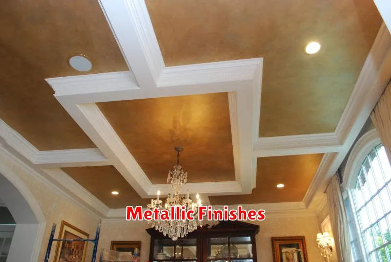
Metallic finishes are experiencing a surge in popularity in interior design, offering a unique blend of modernity and sophistication. From subtle shimmer to bold, reflective surfaces, these finishes add a touch of luxury and drama to any space.
The appeal of metallics lies in their versatility. They can complement a wide range of styles, from minimalist and contemporary to traditional and eclectic. A brushed gold accent can warm up a modern living room, while a sleek silver finish can add a touch of futuristic coolness to a kitchen. The possibilities are truly endless.
Different metallic finishes offer distinct visual effects. For instance, brushed finishes have a more textured, understated look, perfect for creating a sense of calm and serenity. Polished finishes, on the other hand, offer a high-gloss, reflective surface that can make a space feel larger and more dramatic.
When incorporating metallic finishes into your home, consider the overall color palette. Gold and copper tones pair beautifully with warm earth tones and jewel-toned colors, while silver and platinum work well with cooler shades of blue, green, and gray. A balanced approach is key to avoiding an overwhelming or garish effect.
Popular choices for metallic finishes include gold, silver, copper, bronze, and brass. Each metal offers a unique tone and character, allowing you to tailor the look to your personal preference. Consider using these finishes strategically—on light fixtures, hardware, furniture accents, or even wall coverings—to create a cohesive and stylish design.
Ultimately, metallic finishes provide a wonderful opportunity to inject personality and visual interest into your home. With careful planning and consideration of the overall design aesthetic, you can create a space that is both luxurious and inviting, showcasing the unique beauty and versatility of these stunning finishes.
Textured Walls
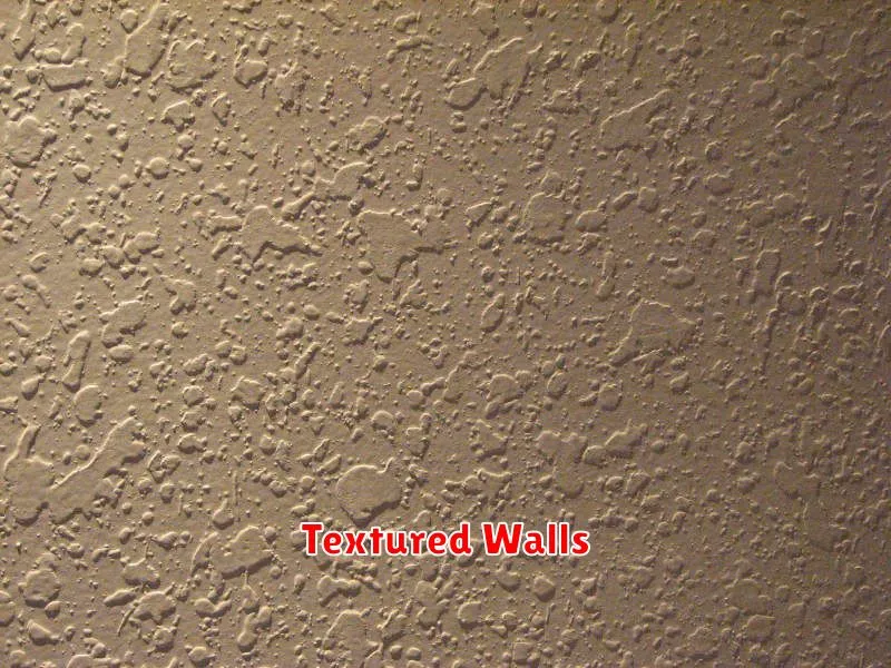
Adding texture to your walls is a fantastic way to elevate the aesthetic appeal of any room. It moves beyond the limitations of flat, painted surfaces, offering a unique depth and dimension that can dramatically alter the overall feel of a space.
There are numerous techniques to achieve textured walls, catering to various styles and budgets. From simple DIY projects to professional installations, the options are vast. Consider the impact you want to create: a subtle, elegant touch, or a bold, statement piece?
Popular Texturing Techniques:
DIY Options: These methods are perfect for budget-conscious homeowners and those who enjoy hands-on projects. Popular choices include applying a textured paint (using various tools like sponges or rags), creating a knockdown texture (applying a thicker coat of joint compound and then smoothing it partially), or employing stucco for a more rustic look.
Professional Techniques: For a flawless, highly-detailed finish, consider hiring a professional. They can offer a wider array of techniques such as Venetian plaster for a luxurious, antique effect, or specialized textured wallpapers for easy installation and diverse patterns.
Choosing the Right Texture:
The best texture for your walls depends heavily on your personal preference and the overall style of your home. A smooth, subtle texture can create a sense of calm and sophistication, while a more pronounced texture adds character and visual interest. Consider the size and shape of the room; a bolder texture might overwhelm a small space.
Color Considerations: The color you choose will interact significantly with the wall texture. Lighter colors can make a textured wall appear more subtle, while darker colors can emphasize the texture’s depth and contours. Experiment with different shades to find the perfect balance.
Ultimately, textured walls offer a wealth of creative possibilities. By carefully considering the various techniques, styles, and colors, you can transform your home with unique and captivating wall designs.
Pastel Layers
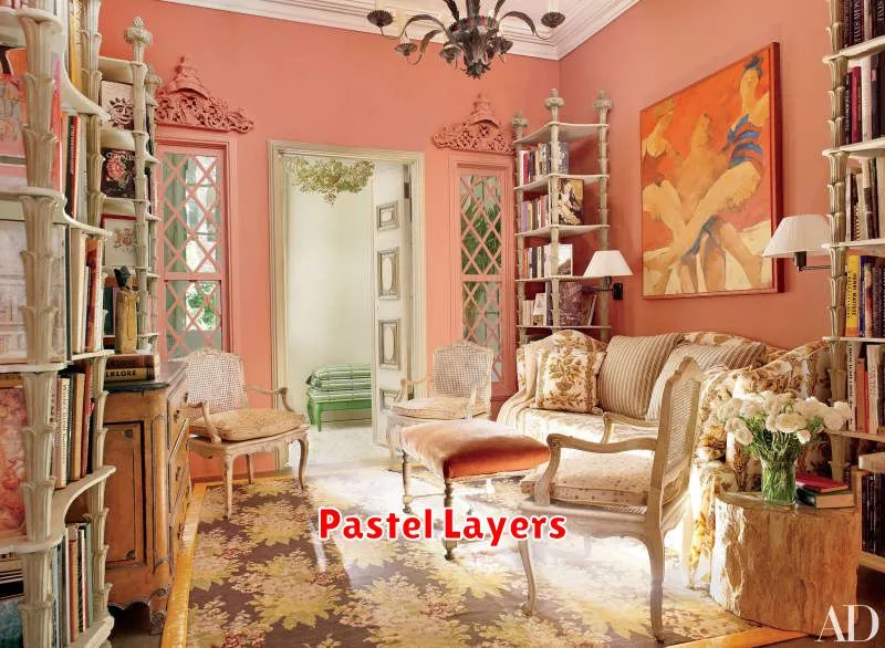
Pastel layers are a beautiful and versatile technique used in various art forms, from painting and drawing to baking and even fashion design. The core concept involves layering soft, light colors on top of each other to create depth and a sense of ethereal beauty. The subtle gradations and delicate transitions between hues are what make this technique so captivating.
In painting, pastel layers allow artists to build up rich textures and luminosity. By applying thin, translucent layers of pastel, the underlying colors subtly influence the final result, creating a luminous effect. This allows for a beautiful blend of colors, avoiding harsh lines and creating a sense of movement.
The application of pastel layers in drawing is similar. The artist can gradually build up the intensity of color and value by adding layers of pastel, achieving a remarkable depth and detail. This technique is particularly well-suited for creating soft, delicate subjects, such as flowers or portraits.
Even in the culinary world, pastel layers find their place. Think of a beautifully layered cake with shades of pink, lavender, and mint green, each layer subtly different, yet harmoniously complementing the others. The visual appeal is undeniably stunning and adds an element of sophistication.
Ultimately, the power of pastel layers lies in their ability to create a sense of tranquility and dreamy atmosphere. The soft, harmonious hues evoke a feeling of peace and serenity, making them a popular choice for various creative endeavors. Whether in art, food, or fashion, pastel layers offer a unique aesthetic that captivates and inspires.
Experimenting with pastel layers can be a rewarding experience. Don’t be afraid to try different color combinations and layering techniques to discover your own unique style. The possibilities are endless!
Geometric Shapes
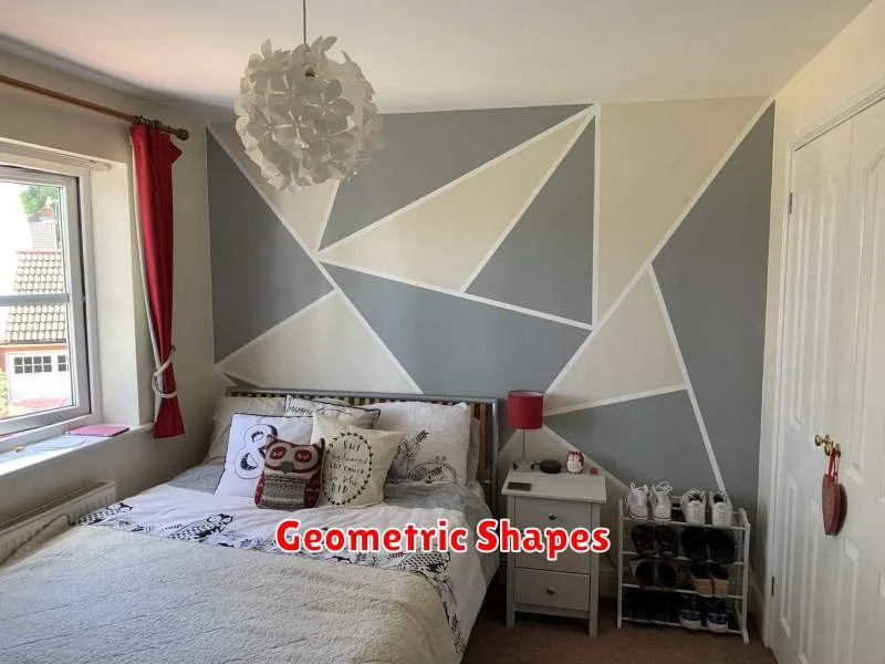
Geometric shapes are fundamental building blocks in mathematics and are found everywhere around us, from the man-made structures in our cities to the natural formations in the world. Understanding these shapes is key to grasping many aspects of geometry, design, and even art.
We can broadly categorize geometric shapes into two main groups: two-dimensional (2D) and three-dimensional (3D). 2D shapes are flat and have only length and width, while 3D shapes possess length, width, and height, occupying a volume in space.
Two-Dimensional Shapes
Some common examples of 2D shapes include:
- Circle: A round shape with all points equidistant from the center.
- Square: A four-sided polygon with all sides equal in length and all angles equal to 90 degrees.
- Rectangle: A four-sided polygon with opposite sides equal in length and all angles equal to 90 degrees.
- Triangle: A three-sided polygon with three angles that add up to 180 degrees.
- Polygon: A closed figure formed by three or more line segments.
Three-Dimensional Shapes
Examples of 3D shapes include:
- Sphere: A perfectly round three-dimensional object.
- Cube: A three-dimensional shape with six square faces, all equal in size.
- Cuboid (Rectangular Prism): A three-dimensional shape with six rectangular faces.
- Cone: A three-dimensional shape with a circular base and a single vertex.
- Cylinder: A three-dimensional shape with two parallel circular bases connected by a curved surface.
- Pyramid: A three-dimensional shape with a polygonal base and triangular faces that meet at a single vertex.
The study of geometric shapes allows us to understand and analyze the world around us in a more precise and systematic way. From calculating the area of a room to designing complex engineering structures, a solid understanding of geometric shapes is invaluable.
Tonal Gradients
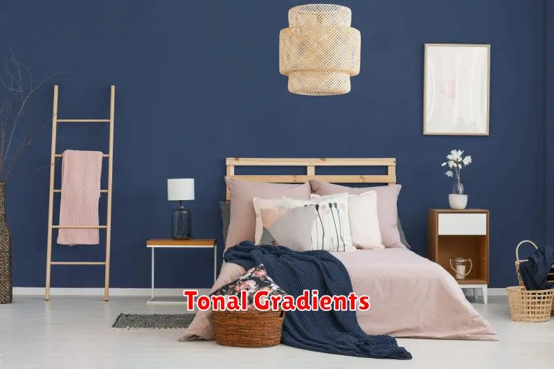
Tonal gradients are a powerful design tool used to create visually appealing and harmonious transitions between colors. They differ from other gradients in their focus on subtle shifts in brightness and saturation, rather than dramatic changes in hue. This subtle approach often results in a more sophisticated and refined aesthetic.
The key to effective tonal gradients lies in selecting a starting color and then carefully adjusting its lightness and saturation values to create a smooth progression. The resulting gradient often appears as a smooth transition from light to dark or vice-versa, or a subtle shift in color intensity. This creates a sense of depth and dimension that can enhance the overall design.
Applications of tonal gradients are widespread in design. They are commonly used in:
- Backgrounds: To create subtle and elegant backgrounds for websites or applications.
- UI Elements: To add depth and visual interest to buttons, forms, or other interactive elements.
- Illustrations: To create smooth transitions in color within illustrations or graphic designs.
- Photography: In post-processing, subtle tonal gradients can enhance the mood and atmosphere of photographs.
When designing with tonal gradients, consider the overall mood and message you want to convey. Light, airy gradients can create a feeling of calmness and serenity, while darker, richer gradients might evoke a sense of sophistication or drama. Careful selection of the starting color and the degree of variation in lightness and saturation is crucial for achieving the desired effect.
Tools for creating tonal gradients are readily available. Many graphic design software programs, such as Adobe Photoshop and Illustrator, offer built-in tools for generating and manipulating gradients. Online resources and color palettes also provide pre-made options for inspiration and quick implementation.
In conclusion, mastering tonal gradients is a valuable skill for any designer. Their ability to create visually appealing and harmonious transitions makes them a versatile and effective design element. By understanding the principles of lightness, saturation, and their application, you can elevate your designs and create truly stunning visual experiences.
Abstract Murals
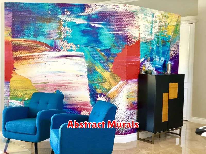
Abstract murals offer a unique and exciting way to transform any space. Their non-representational nature allows for a vast spectrum of interpretation and emotional response, making them incredibly versatile pieces of art.
Unlike traditional murals depicting recognizable scenes or objects, abstract murals focus on color, shape, texture, and composition to create a visually stimulating experience. This freedom from realism allows artists to express themselves in bold and innovative ways, resulting in truly one-of-a-kind pieces.
The impact of an abstract mural can be profound. They can evoke a feeling of calm and tranquility, or inject energy and vibrancy into a room. The choice of color palette and design elements plays a crucial role in setting the overall mood and atmosphere.
Customization is a key advantage of abstract murals. Artists can work closely with clients to develop designs that reflect personal preferences, brand identities, or the specific aesthetic of a location. This collaborative process ensures that the final piece is perfectly tailored to its surroundings.
Whether used in commercial settings, like offices or retail spaces, or in residential environments, such as homes or apartments, abstract murals offer a contemporary and stylish approach to interior design. They are a conversation starter, a focal point, and a powerful way to express personality and creativity.
Materials used in creating abstract murals are diverse, ranging from traditional paints and brushes to more unconventional techniques and mediums. This versatility allows for a wide range of textures and finishes, adding another layer of complexity and visual interest.
In conclusion, abstract murals are more than just wall decorations; they are powerful statements of artistic expression, capable of transforming a space and enriching the lives of those who experience them. Their versatility, impact, and customizability make them a compelling choice for both artists and clients alike.
Rustic Brush Strokes
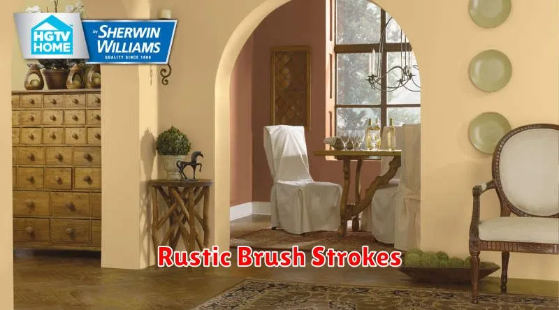
Rustic style is all the rage right now, and for good reason! Its warm, inviting aesthetic offers a welcome escape from the sterile minimalism often seen in modern design. But achieving a truly authentic rustic look goes beyond simply adding a few wooden accents. It’s about understanding the underlying principles and applying them with intention.
One key element of rustic design is the use of natural materials. Think rough-hewn wood, weathered stone, and unbleached linen. These materials possess a unique texture and character that is difficult to replicate artificially. The imperfections are part of their charm, telling a story of age and wear. Don’t be afraid to embrace these imperfections; they are what make rustic design so appealing.
Color palettes play a crucial role in establishing the rustic ambiance. Earthy tones like browns, greens, and creams dominate, often complemented by deeper accents of burgundy, ochre, or forest green. These hues evoke a sense of the outdoors, grounding the space and creating a feeling of tranquility. Consider using a muted color palette to enhance the rustic feel.
Beyond materials and colors, texture is equally important. Layering textures adds depth and visual interest. Combine smooth surfaces with rough ones, soft fabrics with hard materials. This interplay of textures adds richness and complexity to the overall design. Think about incorporating woven baskets, chunky knit throws, or distressed furniture to achieve this effect.
Finally, lighting is key to completing the rustic look. Warm, ambient lighting is essential. Consider using natural light sources whenever possible, and supplementing with warm-toned lamps and candles. This will create a cozy and inviting atmosphere, perfect for relaxing and unwinding.
By carefully considering these elements – natural materials, earthy color palettes, layered textures, and warm lighting – you can create a truly authentic and captivating rustic space. Remember, the goal is to create a feeling of warmth, comfort, and connection to nature. Let your creativity flow and enjoy the process of building your rustic haven.